Size
Large objects usually feel heavier.
GRAPHIC DESIGN / WEEK 2
THE BIG IDEA
Balance is the way visual weight is distributed across a composition.
Large objects usually feel heavier.
Bright, dark or saturated colors demand attention.
Texture and complexity create visual pull.
Distance from center can add visual weight.
THREE WAYS TO ORGANIZE
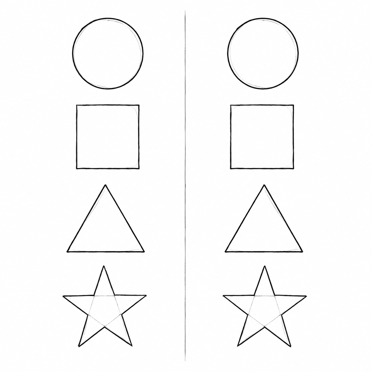
Both sides of an imaginary line are the same or very similar. It feels formal, stable, calm and orderly.
Look for: matching size, shape, color and placement.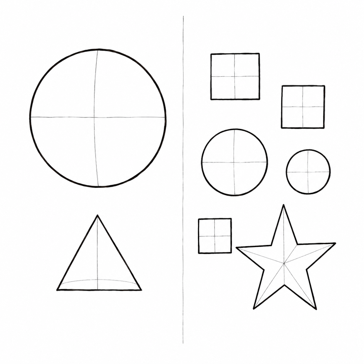
The two sides are not identical, but their visual weight still feels equal. It feels active, modern and interesting.
Look for: one large object balanced by several smaller ones.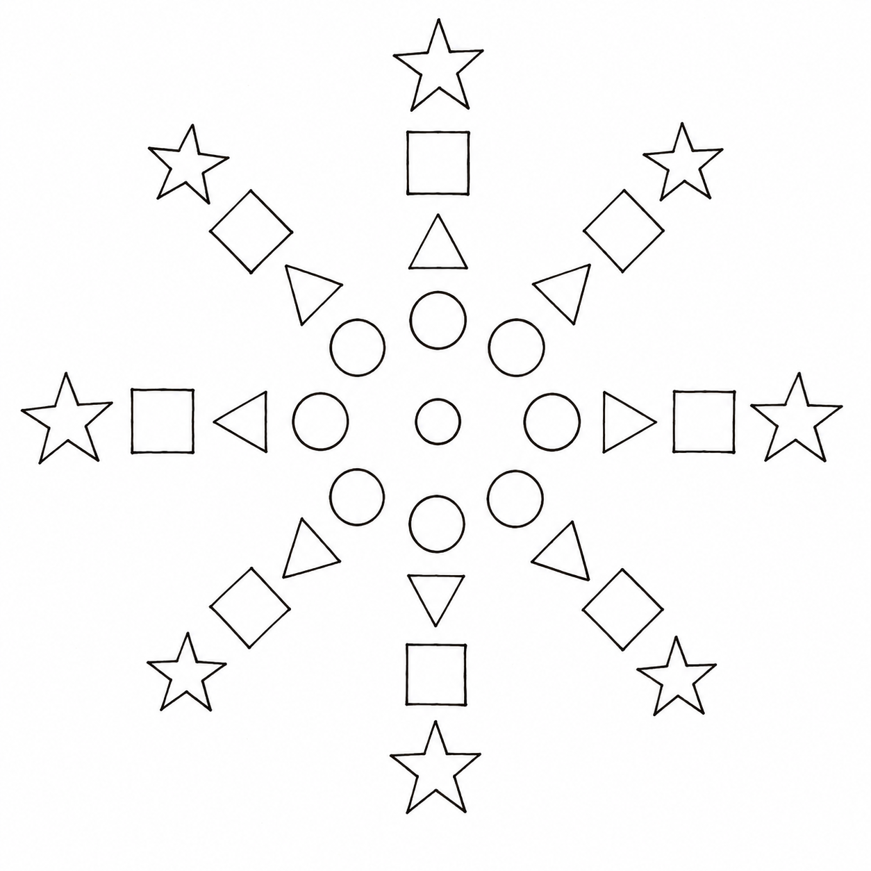
Elements spread outward from a central point. It creates movement while keeping attention focused in the middle.
Look for: circles, spirals, rays or repeated rotation.STUDIO ACTIVITY
Cut one large and one small version of each shape:
Draw a light vertical line down the center of your background page. Do not glue yet.
SKETCHBOOK REFLECTION
Title a new page Reflection: Balance, then respond:
Look at your finished design as if the shapes were clouds. What real images, people, objects or scenes could replace them? Describe what you see and explain which shapes suggested it. Could it become a car on a road, a ship in the ocean, a mother and child, or a child with their dog?